
REVIEW-JOURNAL 7@7 GRAPHICS PACKAGE
Since the launch of 7@7 Las Vegas Review Journal has tripled their revenue. Listed as “10 news publishers that do it right”
https://www.editorandpublisher.com/stories/10-news-publishers-that-do-it-right,219623?newsletter=219852
The Brief: Design News package for RJ’s new show 7@7. Shows are 7 minutes long at 7am and 7pm. Based off kick-off call this look should be an extension of the current RJ news look that you already created for us, but an entity of itself, not an exact replica. Style should be clean, bold, slightly slower speed than current RJ package. Color palette should be less red, but still consistent with RJ’s digital news brand. Since a large percentage of viewers watch RJ on their phones, we need to be mindful of how the graphics look in various scaling. Three different concepts will be presented. Logo files will be supplied once one is chosen.
CONCEPT 1: AT THE CENTER OF IT ALL
The Las Vegas Review-Journal has been AT THE CENTER OF IT ALL covering news for generations. In Concept 1’s color palette there is a balance of color with a touch of grey to add depth and movement. A few text elements were added for texture and movement. The 7@7 logo was the inspiration with it’s circular shape and angled lines in the 7’s and bar. Concept 1 is a bold and clean design with a splash of Vegas flair neon line effects. *Logo subject to change once approval has been completed.
CONCEPT 2: TIME IS OF THE ESSENCE
TIME IS OF THE ESSENCE in media, a all-hands-on-deck mindset to get the stories out to viewers. The RJ delivers breaking news, top stories and much more. During brainstorming with the logo’s shapes, it was discovered that the circle and angles overlapping created triangles and from there a clock started to appear. It symbolized the urgency the media deals with on a daily basis. With concept 2 we incorporated one of the RJ wipes into the beginning of this open giving viewers some familiarity. There is more grey in Concept 2 more warmth less starkness of Concept 1’s palette. Having a lot more grey in this concept lets the bold 7@7 logo really stand out. *Logo subject to change once approval has been completed.
CONCEPT 3: THE LEADING EDGE
The Las Vegas Review-Journal continues to be THE LEADING EDGE in Southern Nevada media. From newspapers and now digital media you are at the forefront of evolving news media. Concept 3 plays off the angled lines from the 7@7 logo. The arrows pointing right are the symbol for the play button while watching online videos. With this look inspired by angled lines, a few angled elements from the RJ open was incorporated for a subtle tie in to the RJ news look but still keeping it’s own identity. *Logo subject to change once approval has been completed.
A MIX OF CONCEPT 1 & 2 WERE CHOSEN. FINAL LOGO WAS ADDED & REVISIONS TO MIX 2 CONCEPTS TOGETHER FOR DELIVERABLES.
Deliverables: Show open, Lower Third Logo Loop and Still, 2 Looping Backgrounds, ChromaKey Wall Loop, Monitor Loop, Corner Framed Loop, 5 Locator Boxes, Closing Credits, Bug, 9 Segment Fullscreens, 3 Fullscreens, & 4 Wipes.
7@7 OPEN
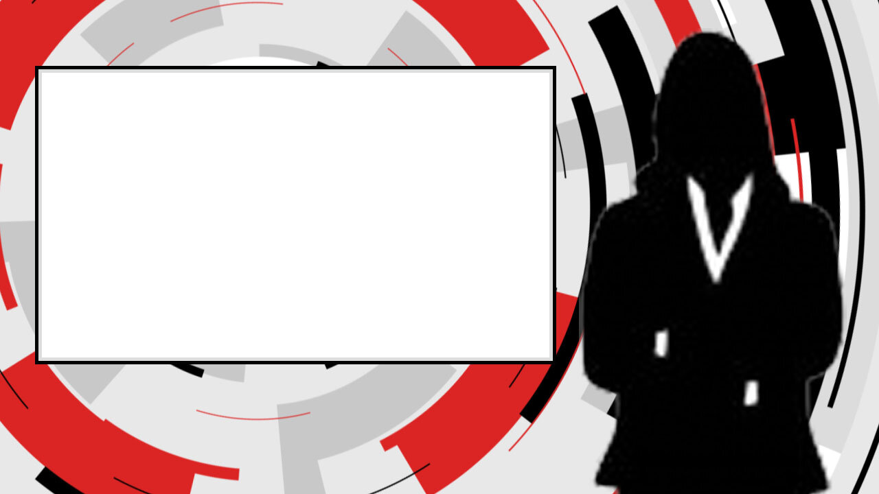
CHROMAKEY, FULLSCREENS AND LOCATOR BOX EXAMPLES

LVRJ.COM 6 SECOND BRANDED TRANSITIONAL WIPE
AM PM 4 SECOND BRANDED TRANSITIONAL WIPE
LVRJ.COM 3 SECOND BRANDED TRANSITIONAL WIPE
RJ APP PROMO
VEGAS GOLDEN KNIGHTS REILLY SMITH 7@7 PROMO
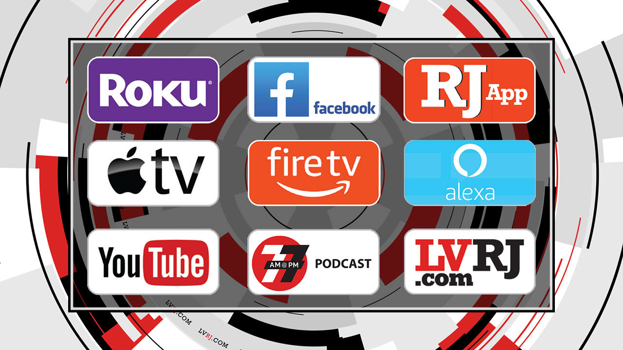
Promo endplates include: LVRJ.com app, Amazon Fire, Roku, YouTube and RJ app.